Hello guys the bokeh module is not displaying any graphs please help
1 Like
Thanks for the report! We’ll check it out.
Hello, I have the same problem and can’t find a solution
I would be grateful if someone can help
Hm, it’s weird, it works fine for me in previously created notebooks, but it produces no output in new ones. Thanks for the heads up! Will ask the devs to check this out.
Thanks for your answer, I hope they can solve the problem.
Looks like I fell into the same trap as you did – one need to use output_notebook with Jupyter Notebooks:
So the correctly working code would look like:
from bokeh.plotting import figure, output_notebook, show

# prepare some data
x = [1, 2, 3, 4, 5]
y = [6, 7, 2, 4, 5]

output_notebook()

# create a new plot with a title and axis labels
p = figure(title="Simple line example", x_axis_label="x", y_axis_label="y")

# add a line renderer with legend and line thickness
p.line(x, y, legend_label="Temp.", line_width=2)

# show the results
show(p)
But there is a couple of known issues: bokeh charts are not yet supported in printed and/or published notebooks.
Thanks to @artem.borzilov for helping with the investigation.
With your answers I realise that we weren’t talking about exactly the same thing, I might have chosen the wrong topic because I’m new here and new to Python in general, just tell me if I need to create another topic or if we can continue here.
But my problem is that I do a graph ( a boxplot ) with the extension Bokeh in Holoviews, it seems to work because it doesn’t show me any error but it just display a blank bar under the code and not the graph.
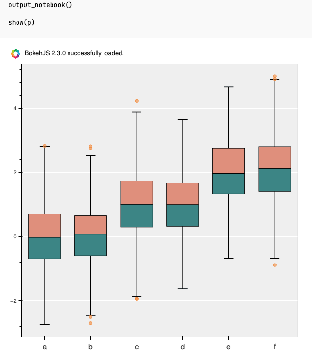
It’s okay to continue in this topic. Let’s use the following example:
In this example they save the produced chart to a file, so in order to display it in the notebook you need to replace output_file with output_notebook (in import statement and in the code), resulting code will look like:
import numpy as np
import pandas as pd

from bokeh.plotting import figure, output_notebook, show

# generate some synthetic time series for six different categories
cats = list("abcdef")
yy = np.random.randn(2000)
g = np.random.choice(cats, 2000)
for i, l in enumerate(cats):
    yy[g == l] += i // 2
df = pd.DataFrame(dict(score=yy, group=g))

# find the quartiles and IQR for each category
groups = df.groupby('group')
q1 = groups.quantile(q=0.25)
q2 = groups.quantile(q=0.5)
q3 = groups.quantile(q=0.75)
iqr = q3 - q1
upper = q3 + 1.5*iqr
lower = q1 - 1.5*iqr

# find the outliers for each category
def outliers(group):
    cat = group.name
    return group[(group.score > upper.loc[cat]['score']) | (group.score < lower.loc[cat]['score'])]['score']
out = groups.apply(outliers).dropna()

# prepare outlier data for plotting, we need coordinates for every outlier.
if not out.empty:
    outx = list(out.index.get_level_values(0))
    outy = list(out.values)

p = figure(tools="", background_fill_color="#efefef", x_range=cats, toolbar_location=None)

# if no outliers, shrink lengths of stems to be no longer than the minimums or maximums
qmin = groups.quantile(q=0.00)
qmax = groups.quantile(q=1.00)
upper.score = [min([x,y]) for (x,y) in zip(list(qmax.loc[:,'score']),upper.score)]
lower.score = [max([x,y]) for (x,y) in zip(list(qmin.loc[:,'score']),lower.score)]

# stems
p.segment(cats, upper.score, cats, q3.score, line_color="black")
p.segment(cats, lower.score, cats, q1.score, line_color="black")

# boxes
p.vbar(cats, 0.7, q2.score, q3.score, fill_color="#E08E79", line_color="black")
p.vbar(cats, 0.7, q1.score, q2.score, fill_color="#3B8686", line_color="black")

# whiskers (almost-0 height rects simpler than segments)
p.rect(cats, lower.score, 0.2, 0.01, line_color="black")
p.rect(cats, upper.score, 0.2, 0.01, line_color="black")

# outliers
if not out.empty:
    p.circle(outx, outy, size=6, color="#F38630", fill_alpha=0.6)

p.xgrid.grid_line_color = None
p.ygrid.grid_line_color = "white"
p.grid.grid_line_width = 2
p.xaxis.major_label_text_font_size="16px"

output_notebook()

show(p)
When output_notebook() is used, the resulting chart should be displayed in the cell output:
Hey, thank you for your answer ! I’m really sorry for the delay.
Here you only use bokeh which seems to work but what I was talking about was using the library holoviews and its extension that uses bokeh and it doesn’t display anything else than a blank under the code cell.
Here is a simple code I took in the holoviews documentation so you can see by yourself:
import holoviews as hv
from holoviews import opts
hv.extension('bokeh')
from bokeh.sampledata.autompg import autompg

autompg_ds = hv.Dataset(autompg)

hist = autompg_ds.hist(dimension='mpg', groupby='cyl', bin_range=(9, 46), bins=40, adjoin=False)
hist.opts(opts.Histogram(alpha=0.9, width=600))
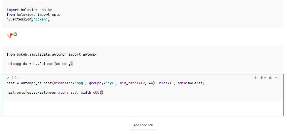
Here you can see the blank under the last cell which is supposed to display a graph.
I hope you have an answer on why it doesn’t work or a solution to make it work because the holoviews is very simple to use to display beautiful and interactive graphs.
1 Like
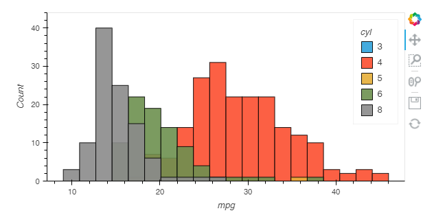
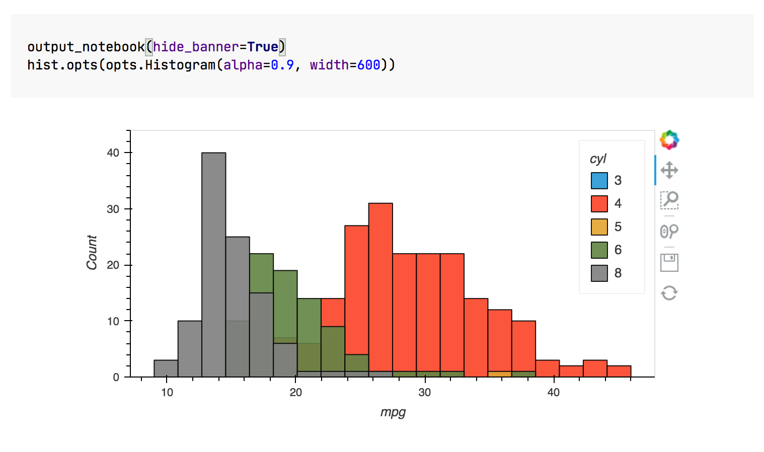
This graph is supposed to be displayed:
Hi Nathan,
As a quick solution you can call hv.extension("bokeh") in each cell that has a chart:
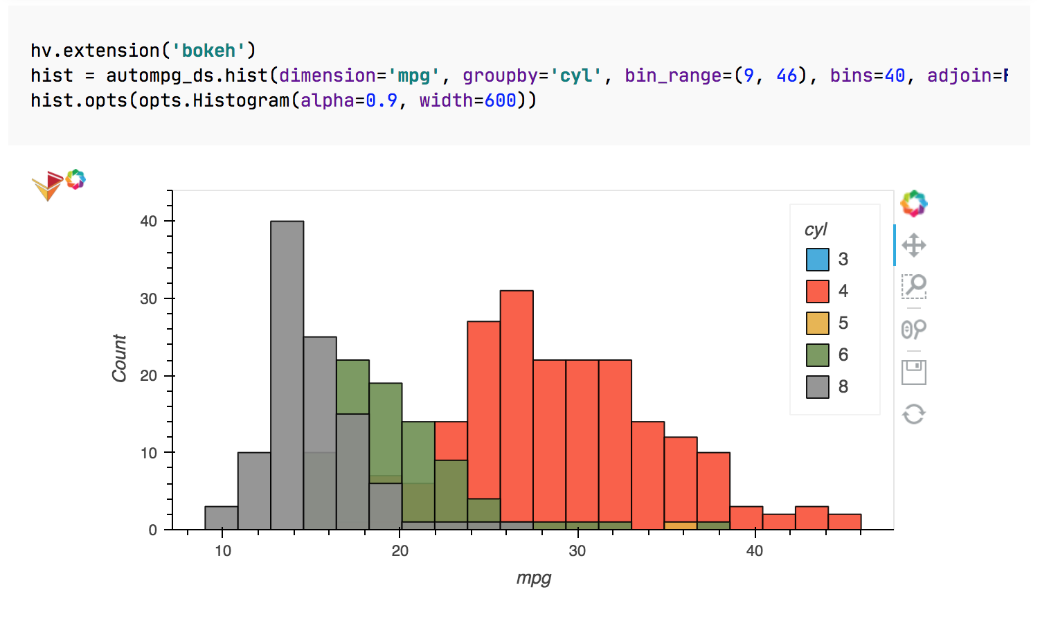
The idea is to load corresponding js in each cell output because the outputs are sandboxed. Maybe holoview has a setting that enables this behaviour by default but I’m not aware of it atm
You can also use output_notebook from bokeh.io in each cell instead, it has a handy hide_banner option
2 Likes
Thanks for your answer ! I would like to thrank you a lot because it now seems to work well with output_notebook ! ( I prefered this solution because hv.extension(“bokeh”) can rapidly make the code long to run )
2 Likes